Accessibility: A Key To Conversion?
Intro
I mostly write code in a Javascript world. Nextjs, Gatsby, plain old custom React…
It’s awesome. But, largely, you can do anything with anything. A button can be a link. A link can be a button. You largely don’t need a form tag to submit a form. The accessibility of your app can easily can go straight to hell.
Heck, Netlify’s CMS that I’m writing this blog on right now doesn’t have a form/input/text area tag anywhere to be found:

And this lack of needing to follow HTML syntax to produce results is largely allowed us to really do some cool things on the web. We’re basically able to build desktop/mobile apps on the web. (Though there are some limitations. For example, I’m dying for there to be a wait to simulate Haptics on click over JS. You can almost do it with Android. But, not with Apple.)
But, what I’ve found is that if you pay attention to accessibility you build better, more complete apps.
Why Accessibility
Wikipedia defines accessibility as the design of products, devices, services, or environments for people with disabilities.
That’s great and all. But, the move fast and break things culture of Bootstrapped businesses and Startups rarely cares about the margins. And, accessibility has mostly been thrown into the bucket of “It’d be nice to have, but…” by most of these companies.
So, I’m going to make a different argument.
I think accessibly can generally be used as a litmus test for improving conversion of landing pages, in-app conversion, and generally drive more business.
The Mouse
How often have you seen a designer throw some important text behind a hover?
Here’s an example:

The hover effect (in my opinion) is not consistently treated well on mobile. iOs and Android don’t agree on what happens when a user touches an element with a hover effect.
Moreover, disabled users without mouses cannot easily trigger these elements.
The hover effect is primarily there to service designers who work on 27” iMacs.
It can largely decrease the experience for users on mobile or those without mouses. This is one example I see when looking at my old code or code in the wild where designing for accessibility surfaces things that could actually also boost conversion.
We’re tying the display of elements to an effect that 60% of your users (all those on mobile) simply won’t see. Additionally, there are those like myself would like to browse the web without taking my hands off the keyboard.
Keyboard Shortcuts
Another example that I see a lot in the wild are AJAX/JS forms that hi-jack the submit function.
The build a form with or without a <form> tag. And then create an onClick event on a button or even an <a> tag for submitting the form.
In this example, when users can press the enter key on the input form field for their email…nothing happens.
There is nothing listening for the form submit event.
One literally has to click the submit button to convert on this form. That is not good for conversion.
Example from this site:
Notice how the nav is a button. This makes it clickable with just the space or enter key when it is in focus.
Solutions:
Now, this isn’t a full blown lesson on building accessible apps. These are just a few easy things all developers, marketers, and managers can do to improve their app’s or marketing site’s accessibility
1. Install Airbnb’s EsLinter:
- The Airbnb JS Style Guide is largely a good guide for those writing JS.
2. Use your app without touching the mouse for 15 min a day
- This was the biggest improvement for me. Whether it’s on your phone or on your computer with just the keyboard, you’ll quickly discover yourself reaching for onSwipe JS listeners and building for keyboard shortcuts.
3. Don’t eliminate the “onFocus” css effect.
- That blue hover on buttons and links your designer has been having you remove. Yeah, you’ll realize how important that is once you start using your app with just the keyboard. BTW: on a mac, that blue is a system setting.
4. Test with Google’s Lighthouse
- Google’s Lighthouse console tool is a pretty annoying but good test for the accessibility of your site.
5. Have URL’s for every page/section/tab of your app
- Just because JS lets you create “faux” pages without URLs doesn’t mean you should do it. If you hit refresh and your page changes, or you have to click back into a tab, or you have to re-open something, consider adding a hash to your
window.locationor something that automatically takes you back to the same spot.
6) Use pagination over load more buttons
- This is kind of a subcategory of item #5. But, as your users add more content/blogs/pages, you’ll need to have a way to get to those pages. The ever-popular “load more” button is great till you don’t have a mouse.
Great Example
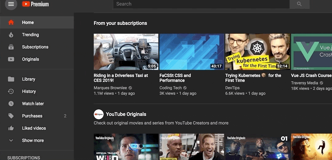
Finally, I’ll leave you with this great example from YouTube.
You literally just hit tab twice, and they show you a hidden button that will take you directly to “focus” on the first video.
It’s simple. But, it probably boosts their views per recommended video. Especially in that disabled and keyboard-only-warrior demographic.